TIL: Layouts with Arbitrarily-Sized CSS Grids
March 27, 2020 • 4 minute read

The more I use CSS grid, the more I ❤ it. Over the last few days, I’ve used arbitrarily-sized grids to achieve two layouts using surprisingly — to me, anyway — small amounts of CSS.
I’ve been working on my RxJS Tools project a — Chrome/Firefox/Edge extension for debugging applications that use RxJS. The tools UI — shown in a developer tools tab in the browser — has two primary components: a tree of subscriptions; and a list of logged notifications.
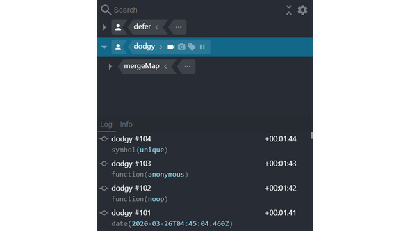
When the tools are docked on the side of the browser, the components should arrange themselves like this:
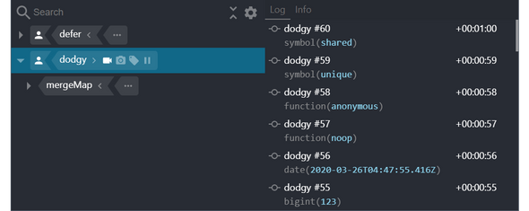
And when they’re docked on the bottom, like this:
I wanted to implement this without using media queries — largely because the tools don’t fill the entire browser viewport in my development harness.
This can be done using a grid with a single row and an arbitrary number of columns. The CSS looks like this:
.panels {
  height: 100%;
  width: 100%;
  display: grid;  grid-template-columns: repeat(auto-fit, minmax(300px, 1fr));}
And the associated HTML elements look something like this:
<div class="panels">
  <div><!-- tree content... --></div>
  <div><!-- list content... --></div>
</div>
The grid-template-columns property is specified using the repeat function. Passing auto-fit to repeat means that the two columns — there are two HTML elements — will be placed on the same row as long as both have widths that are not less than their specified minimums.
The column width range is specified using the minmax function. A column will have a minimum width of 300 pixels and a maximum of 1fr — fr units represent a fraction of the available space.
That means that if there are 600 or more pixels of available width, both components will be placed on the same row, with each being allocated 50% of the available width. However, if there fewer than 600 pixels, there will be two rows and each component will be allocated 100% of the available width.
I thought this was pretty neat.
In the tools, the tree of subscriptions can be searched and filtered using JavaScript expressions — that are typed into the search input — and there are lots of properties (and functions) that can be used in those expressions.
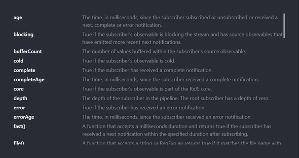
Clicking on the icon beside the search input opens modal that lists all of the properties (and functions) along with their hints. It looks like this:
A layout like this needs to support an arbitrary number of rows and with a grid, that turns out to be straightforward. The CSS looks like this:
.hints {
  display: grid;  grid-template-columns: max-content 1fr;  grid-auto-rows: min-content;  grid-gap: 0.5em;  height: 50vh;
  overflow-y: scroll;
}
And the associated HTML elements look something like this:
<div class="hints">
  <span>age</span>
  <span>The time, in milliseconds, since...</span>
  <span>blocking</span>
  <span>True if the subscriber's observable...</span>
  <!-- more content... -->
</div>
The grid-template-columns property defines two columns: one for the property (or function) identifier; and another for its hint. The column widths are defined as max-content and 1fr, so that the identifier column will be as wide as the widest identifier and the hint column will be allocated all of the remaining, available space.
grid-auto-rows is specified as min-content because the property’s initial value — auto — makes each row the same height. min-content ensures that each row has the height of its content.
And the grid-gap property adds a bit of space between the rows and columns.
Prior to implementing these layouts, I’d only used grids that contained fixed numbers of rows and columns, so my learning about its support for arbitrary numbers of rows and columns has made me ❤ it even more.
Anyway, I think CSS grid is awesome and if you want to learn more about it, you can check out the Complete Guide to Grid from CSS-Tricks.


